|

A
classic 50's poster converted to wallpaper by a little photoshop
editing.
|
Fun
with 50's Science Fiction Posters
Let me tell you about my latest obsession.
It all started in the spring when I built unit
a for a 5th grade class on movie monsters. Now you might say,
"What educational value can be learned by elementary children
from studying Godzilla?" That's a fair question. One that I was
worried might be posed to me by the school principal. The point
of the unit, however, was getting kids interested in reading and
writing and there isn't much that commands a fifth graders attention
better than a good sea monster story or tale about a giant ape.
So the unit was pretty effective and - just as important - met
the state core curriculum standards.
|
Converting
a Poster to Wallpaper
Converting
a poster (or any pictures) into computer wallpaper can be
as easy or as hard as you want. The main problems are finding
an original with enough resolution to make a good, clear
background and then converting the poster (which is usually
taller than wide) to a format that fits your computer screen
(which is wider than tall). A good photo manipulation tool
- Photoshop if you can afford it - helps a
lot.
Use
Start > Control Panel -> Display on your computer to see
at what resolution your screen is set. 1024 pixels wide
by 768 tall is typical. You will need original images -
either found through a search engine or brought in through
your scanner - close to this resolution. If they have to
be enlarged too much the final image will just look blurry
and unprofessional. To make a tall poster into a wide one
you can either create borders around the edges to fill in
the extra space (the easy way) or attempt to cut apart and
recompose the image (much harder).
In either case, use your photo manipulation tool to create
a blank window the size of your screen. Most posters have
the title at the top and credits down at the bottom. By
copying the center portion of the poster out from between
those two items you will wind up with a squarish-shaped
image that I like to plop down in the center-left of the
new screen. Match the color at the edge of the image and
use it to flood the blank area around the edges. You can
then go back and copy over the title, tagline etc. These
can usually be resized and placed on the righthand side
of the new screen, filling in some of the blank space and
creating a balance in the composition. If you want to keep
it easy, you are pretty much done. Just save the image in
JPG format and use the control panel to select it as the
background.
If
you are very good with your photo manipulation tool, somewhat
patient, and have a bit of artistic flare, you can actually
extend the original poster image into the blank areas by
carefully copying and pasting elements of the original image.
Some flipping and airbrushing may be needed to make the
effect seamless.
By
looking around, you also maybe able to find posters that
were wide instead of tall which will make the conversion
a lot simplier. You may also come across "lobby cards"
which were wider than tall. These feature pictures from
the movie along with a logo from the film and are easily
converted to wallpaper also.
For
some examples of the posters I've converted to wallpaper
already, click
here.
|
|
Part of the unit required the kids to design their
own monster movie posters, and in researching I used Google's
image search to track down some old displays. Now I'm a bit of
a fan of the science fiction films from the late 50's and early
60's. They would often show up on TV on Saturday afternoons when
I was a kid. Most of them were pretty bad. A few were very, very
good. Almost all of them had some kind of really cool monster.
What I discovered during my research was that back
then even a really poor movie could have a really good poster.
In fact, it was almost a requirement that a bad film have a great
poster, because if the poster didn't get people into the theater,
the move itself certainly wouldn't.
As I was marveling at some of these posters I started
wondering, what if these films came out today? What other artwork
would the studio publicity department be turning out? Well, of
course, any film that is released today always comes with computer
wallpaper. Thus sprang into my head, my new obsession: creating
wallpaper for my personal computer using old 50's science fiction
movie posters.
Now let me state right here, I am not in the business
of producing wallpaper from movie posters in any commercial sense.
These were for my own personal computer. The studios are very
tolerant of what they call "fan art" and this falls
into that category. So we shouldn't have to worry about violating
a copyright when we do this as long as we don't intend to sell
it or claim some kind of right to it.
Having been a victim of copyright theft myself -
while browsing in Barnes & Noble once I saw the cover of a book
and thought "Gee! That picture looks just like the one I created
for the museum �wait... this is my picture!" - I believe it is
important to safeguard artist's rights. However, the studios like
to generate interest in their old movies by letting fans use them
so long a they aren't trying to make a profit on the images or
undercut the studio's abilty to make money.
Invasion
of the Saucer-Men
The first poster I took a close look at was Invasion
of the Saucer-Men released in 1956. I have to admit that I
have not seen the film. From what I can find out the semi-comic
plot concerns two teenagers who, after making out at the local
lover's lane, run over an alien who's head very much resembles
a cabbage. Word is that the film isn't academy award stuff, but
still better than many of the flicks of that era.
The poster, however, is clearly wonderful. Two huge-headed
aliens with bulging snake-like eyes dominate the scene, one of
them carrying a beautiful, not quite completely clad woman, while
behind them flying saucers ravage the city with what looks like
some kind of death ray. The effect is not as much scary as it
is just bizarre. As with most sci-fi movie posters at the time,
the artist has abandoned any attempt to accurately portray the
movie in an endeavor to make the poster exciting. As far as I
can determine the aliens in the movie are smaller than most humans,
while the poster shows them to be several times as large. There
is only one saucer invading a small town involved in the story,
while the art shows a fleet of them laying waste to a city. As
for the girl, well obviously she was included in the poster to
attract the male patron, not because she is actually carried off
by saucer men in the script.
This brings me to another point. Many of these posters
include a pretty girl being abducted by whatever the dangerous
entity is - amuck robot, slimly fishman or ugly alien. Why? Are
we to assume that the human standard of beauty is universal? I
mean, if the situation were reversed and I invaded their planet
would I be interested in kidnapping an alien female with green
skin, bulging eyes and a giant cabbage head? I doubt I would even
want to touch her, let alone carry her away.
Forbidden
Planet
|

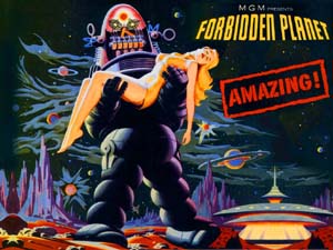
Forbidden
Planet poster converted for wallpaper.
|
Another poster I converted is my all-time favorite
1950's science fiction film, Forbidden Planet. This is
definitely the thinking man's monster movie as the script was
based on Shakespeare's The Tempest. The story involves
a military spaceship that lands on a far-flung planet to check
what has happened to a colony founded there decades before. They
find a reclusive scientist (played by Walter Pidgeon) and his
beautiful daughter Altaira (played by Anne Francis) to be the
lone survivors, the rest of the colonists having been ripped apart
by an unknown monster many years ago. The monster suddenly reappears
to threaten the newly-arrived visitors. The spaceship captain
(Leslie Nelson) must figure out what the monster is and why it
is back before he and his crew are torn limb by limb.
The film also features one of the most famous robots
in motion picture history: Robbie. Robbie is a big, clunky, personification
of what people thought the future would look like in 1956 when
the picture was released. Colored lights blink, antennas spin
and relays clink as he wattles across the set. In the movie he
is the perfect servant, assistant and protector for Altaira and
her father.
|
Bonus:
Watch the Trailer for Plan 9 from Outer Space -
one of the worst of the 1950's films (but not a bad looking
poster)
|
The artist for this poster was stuck in a bit of
a quandary. Poster protocol would have him portray Altaira in
the clutches of the unknown monster. The only snag here is that
the monster is, for the most part, invisible, which doesn't make
for a thrilling image. Again, following the creed that it is more
important that the poster be exciting than accurate, the artist
decided to show Altaira being carried by Robbie. As the robot's
design is quite engaging, this does make for a good poster, though
anybody who has seen the picture would know that Robbie is totally
non-threatening and in fact, never carries the girl during the
film. One might surmise that at some point during the years she
lived on the planet he probably did transport her this way, but
it was most certainly for the purpose of tucking her into bed
after she stayed up too late watching reruns on the stereovision
rather than with any malicious intent.
Whether you like the poster or not, Forbidden
Planet is nearly a perfect motion picture and should be seen
by any true science fiction fan. There has been talk from time
to time of remaking it, but it seems superfluous as the original
is just too good to be made any better.
The
Invisible Boy
|

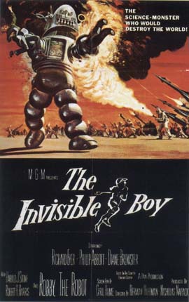
The
original The Invisible Boy poster featuring Robby
the Robot.
|
If Forbidden Planet doesn't need a remake,
the Invisible Boy begs for one. This is a classic case
of a film with great ideas and concepts, but the script doesn't
really hold together. A scientist at a government "think
tank" builds a supercomputer which becomes a sentient megalomaniac.
To take over the world, though, the computer needs the cooperation
of its creator. Seeing the scientist is too busy in his work to
spend time with his young son, the computer hypnotizes the boy
and shows him how to repair a discarded robot (Robbie in another
role). The robot and the boy establish a friendship, which the
supercomputer intends to use to get at the scientist .
The poster for this movie again features Robbie,
, this time holding the boy in one claw and fending off a battalion
of troops armed with rockets, tanks and flamethrowers with the
other. A scene somewhat like this actually appears in the movie,
though Robbie (who is only about the size of a tall man) is much
too small to be holding anybody in his claw.
The
Creature Walks Among Us
This film was the final segment in the popular "Gill-man"
series that started with The Creature from the Black Lagoon
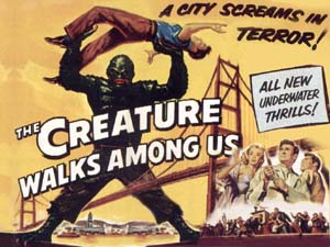
and was the only one not produced in 3-D. The poster for the original
movie is a classic, but I tend to like this one even

The Creatures
Walk Among Us converted for wallpaper.
|
better as the monster is towering over a bridge.
Now, he hasn't grown an inch since the first movie (where he is
just slightly taller than a human) so obviously the artist just
wanted to make the poster a little scarier by making him seem
bigger. For some reason lost over the years it didn't bother the
artist that this makes him totally out of scale with either the
man he is holding over his head or the bridge. Has the creature
been enlarged? Has the bridge shrunk? Have both the Gill-man and
his victim grown bigger?
These kind of questions abound in the movie posters
of that era and even though much of what they portrayed didn't
make sense (occasionally this is a problem for the films also)
the art captured people's attention and ignited their imaginations.
So, purchase one of the books below, or use your favorite search
engine to check this pop art out. If you are going to use a search
engine select for an "image" search, and try the word "poster"
in combination with terms like "monster," "creature," "robot,"
"alien" or "saucer." You are guaranteed to find some forgotten
masterpieces to decorate your computer with!
|
Recommended books and DVDs that cover
this topic:
|

Copyright Lee Krystek 2006.
All Rights Reserved.